Garden Heart — Where Beading, Botanicals and Energy Meet
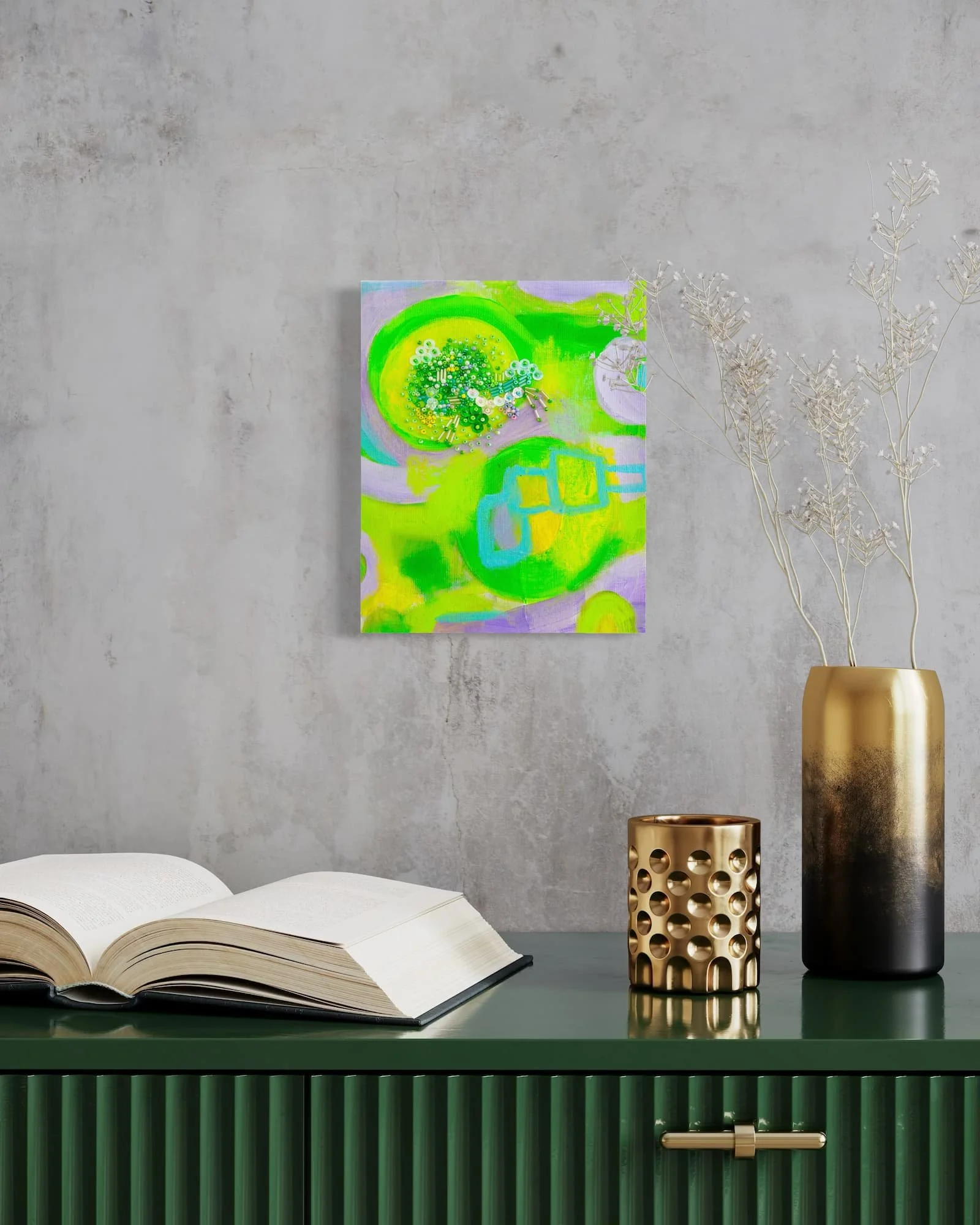
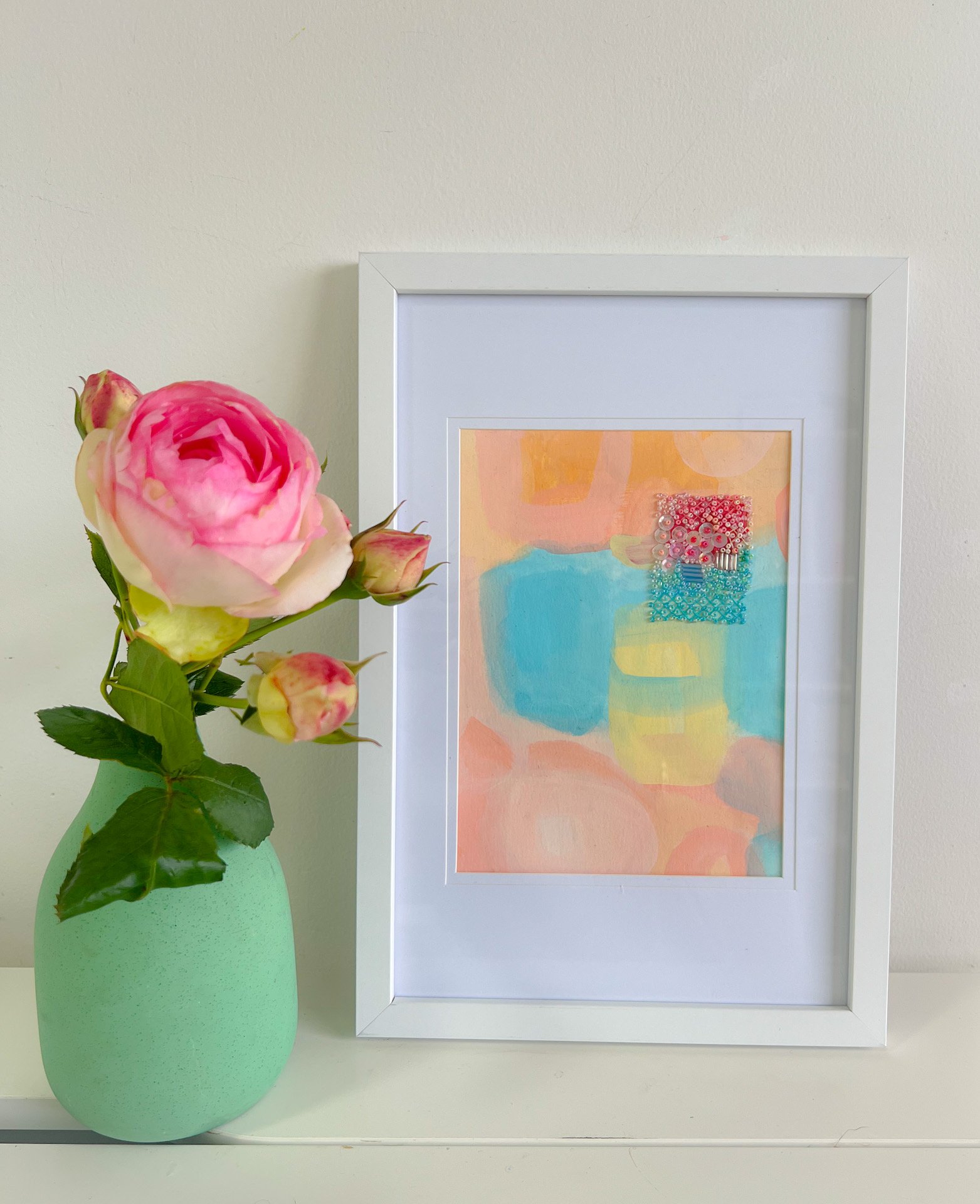
There are paintings you plan and paintings that find you. Garden Heart was the second kind.
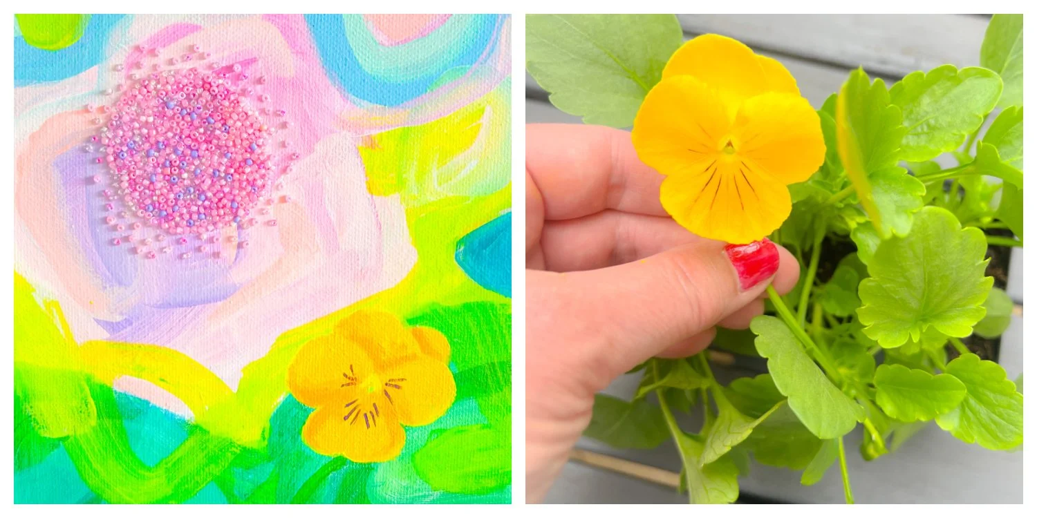
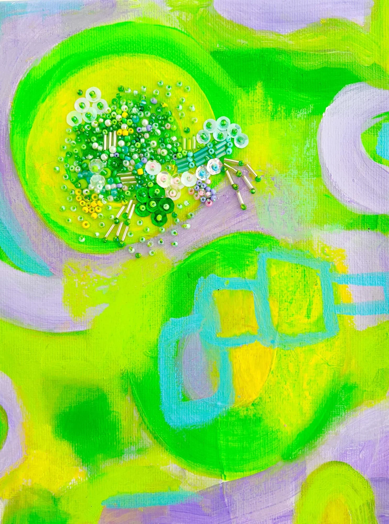
It began, like many of my paintings, with layers of color. The painting was intuitive, energetic, alive with the feeling of a summer garden in full light. Then a soft pink and lavender form emerged from the abstract field, glowing and dreamlike, sitting somewhere between a bloom and pure energy.
And then came the beads.
The Meditative Practice of Beading
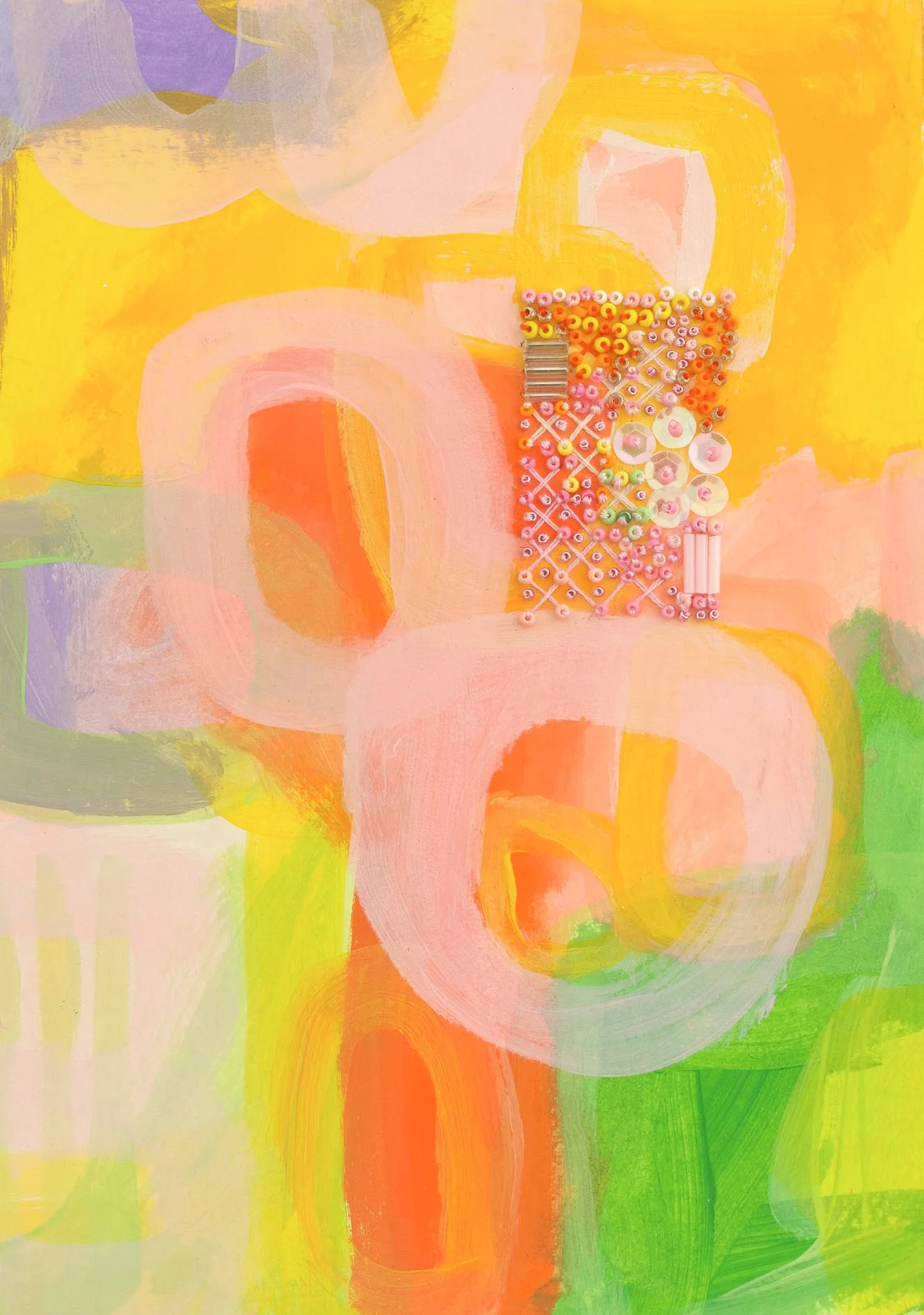
As an intuitive abstract mixed media artist I love including beads in many of my paintings. Each tiny glass bead is placed by hand, one at a time. It is slow, meditative work that mirrors the way energy moves — gathering at the centre, building outward, radiating into the world around it.
The beads in Garden Heart are not decoration. They are light made tangible. Pink and blue glass catching and holding the light differently at every hour of the day.
The Yellow Pansy
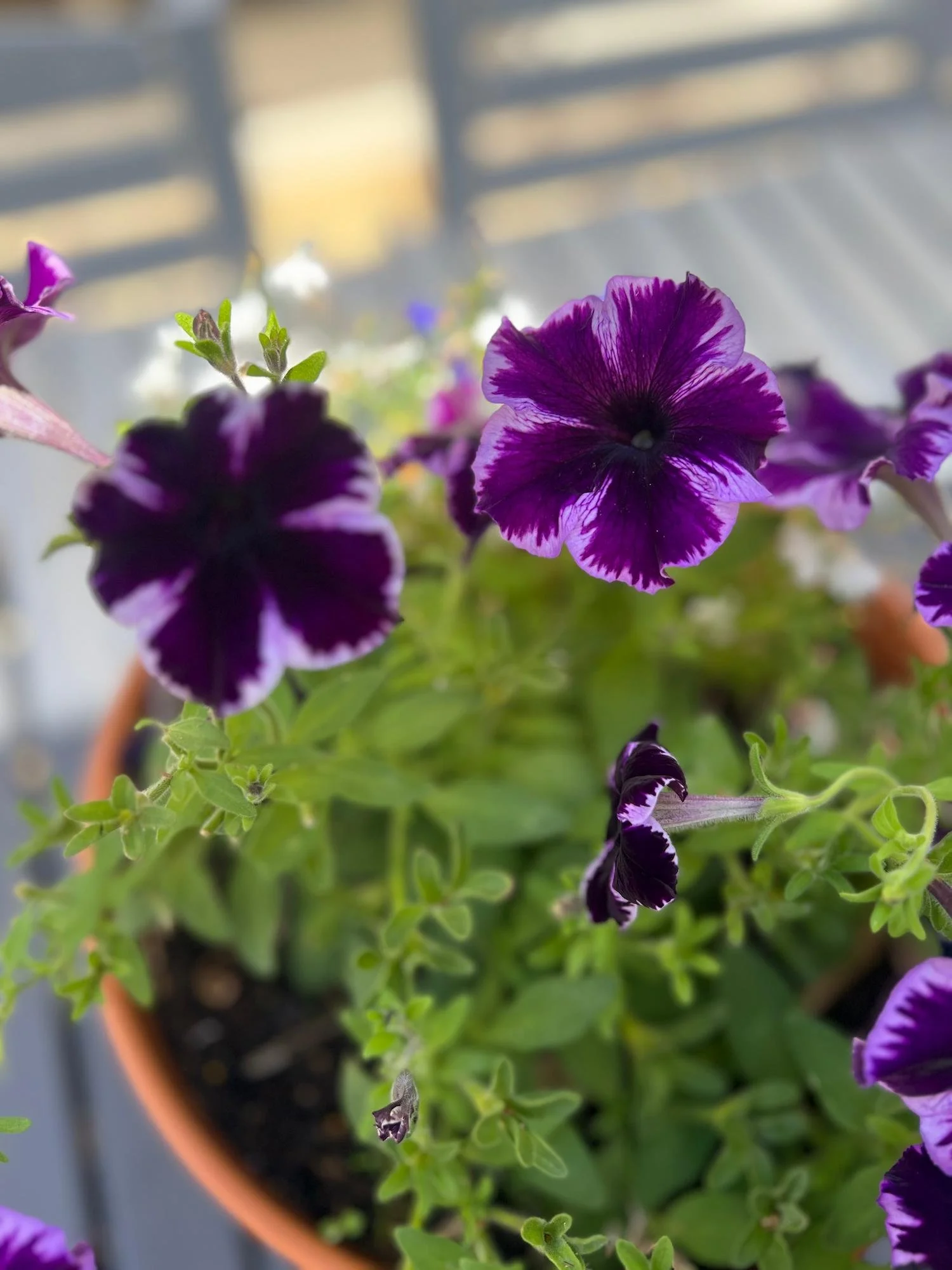
Below the beaded heart a yellow pansy emerges from the colour field — loose and expressive, painted from memory and feeling rather than observation. Pansies grow in my garden and have become a recurring presence in some of my abstract botanical paintings. Small, ordinary, overlooked — and yet full of quiet energy and colour.
This is the tension I am always exploring in my work — the seen and the unseen, the ordinary and the luminous, the garden and the energy field it lives within.
A Painting About Things Unseen
Garden Heart is a painting that places a botanical element at the heart of an abstract energy field. The beading marks the point of maximum energy, the place where the visible and invisible meet.
It is, at its heart, a painting about the things I love most. The joy of a summer garden. The meditative pleasure of hand-beading. The freedom of intuitive abstract colour. And the enduring belief that beauty and energy are the same thing, just seen from different angles. Some paintings are tended this one was made.
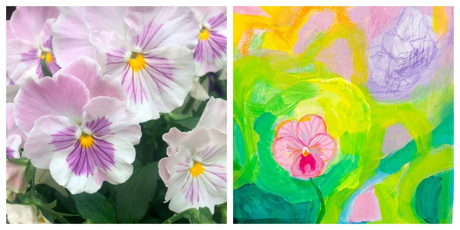
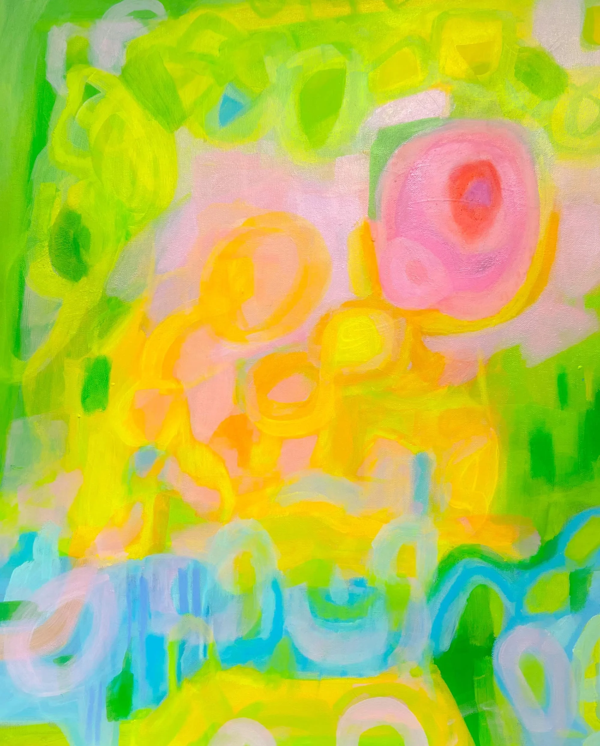
Pink Pansy - Abstract Painting
I have always loved pansies. Their bright cheerful and delicate faces announcing the arrival of spring and summer. This original abstract painting began as an exploration of what happens when a recognisable garden flower emerges from a joyful, intuitive colour field.
The background layers of electric lime green, teal, lavender and yellow arrived first — painted intuitively, alive with the energy of a sun-drenched Melbourne garden in summer. This semi-representational abstract painting sits somewhere between pure abstraction and botanical art.
Pink Pansy marks a new direction in my abstract art practice — allowing recognisable forms to emerge from my colourful abstract world. As a Melbourne abstract artist this felt like a natural evolution, bringing my love of flowers and the garden directly into my work.
You have my Heart - Abstract beaded painting
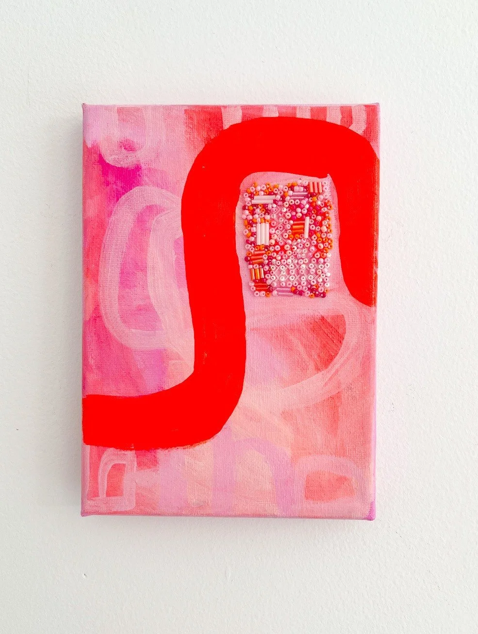
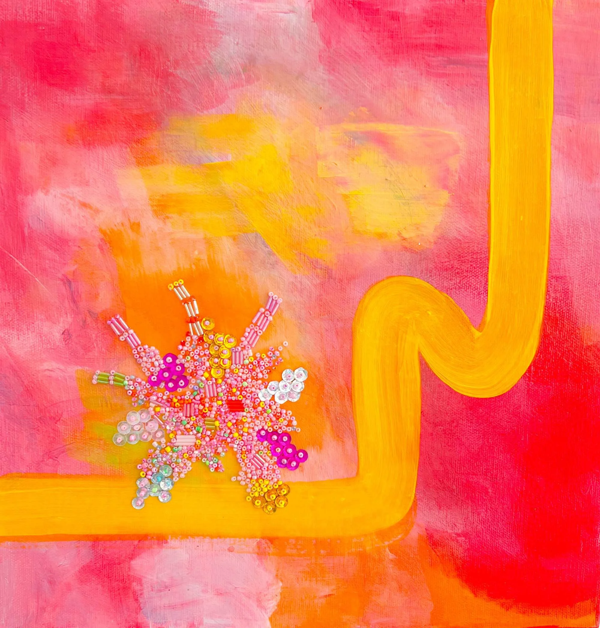
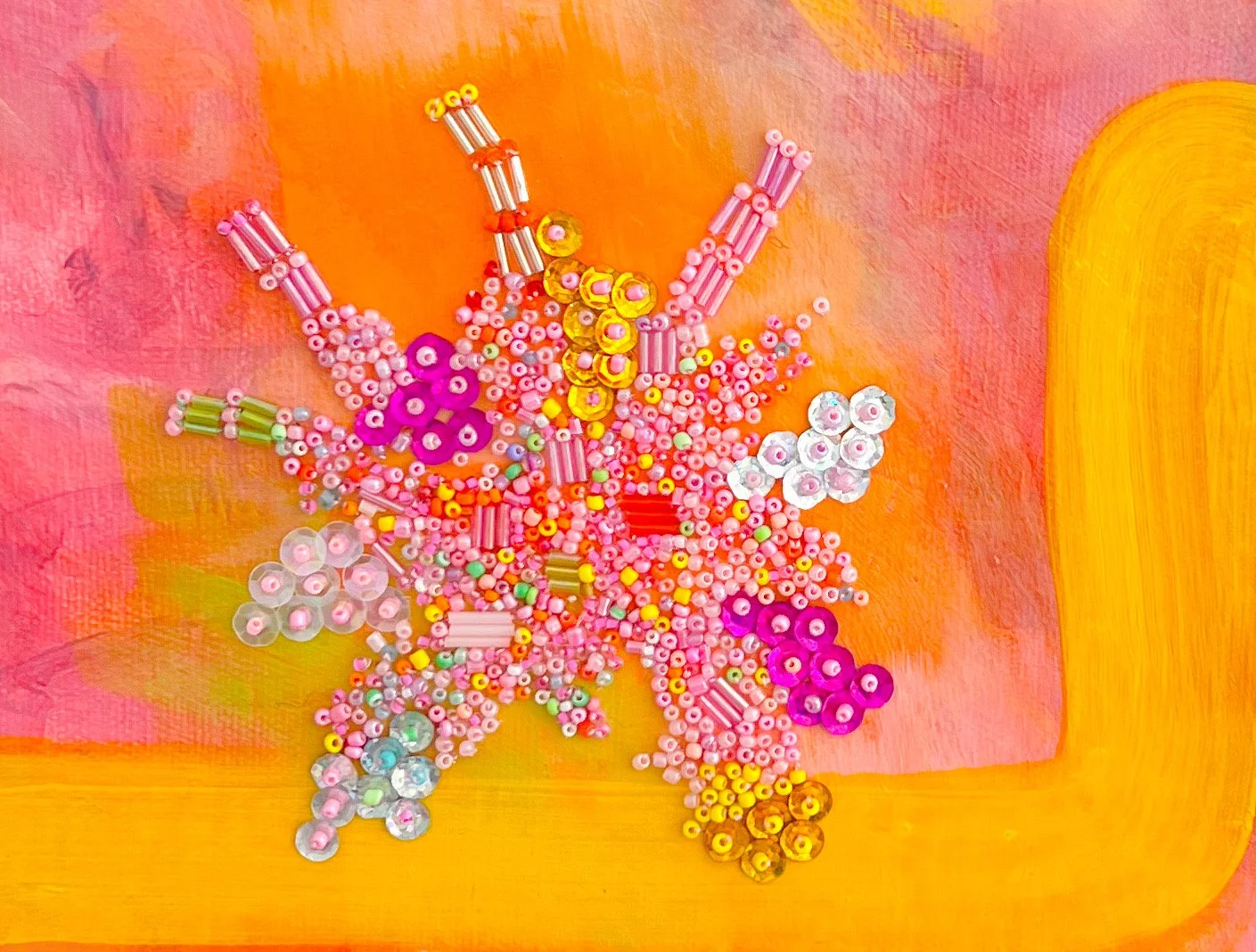
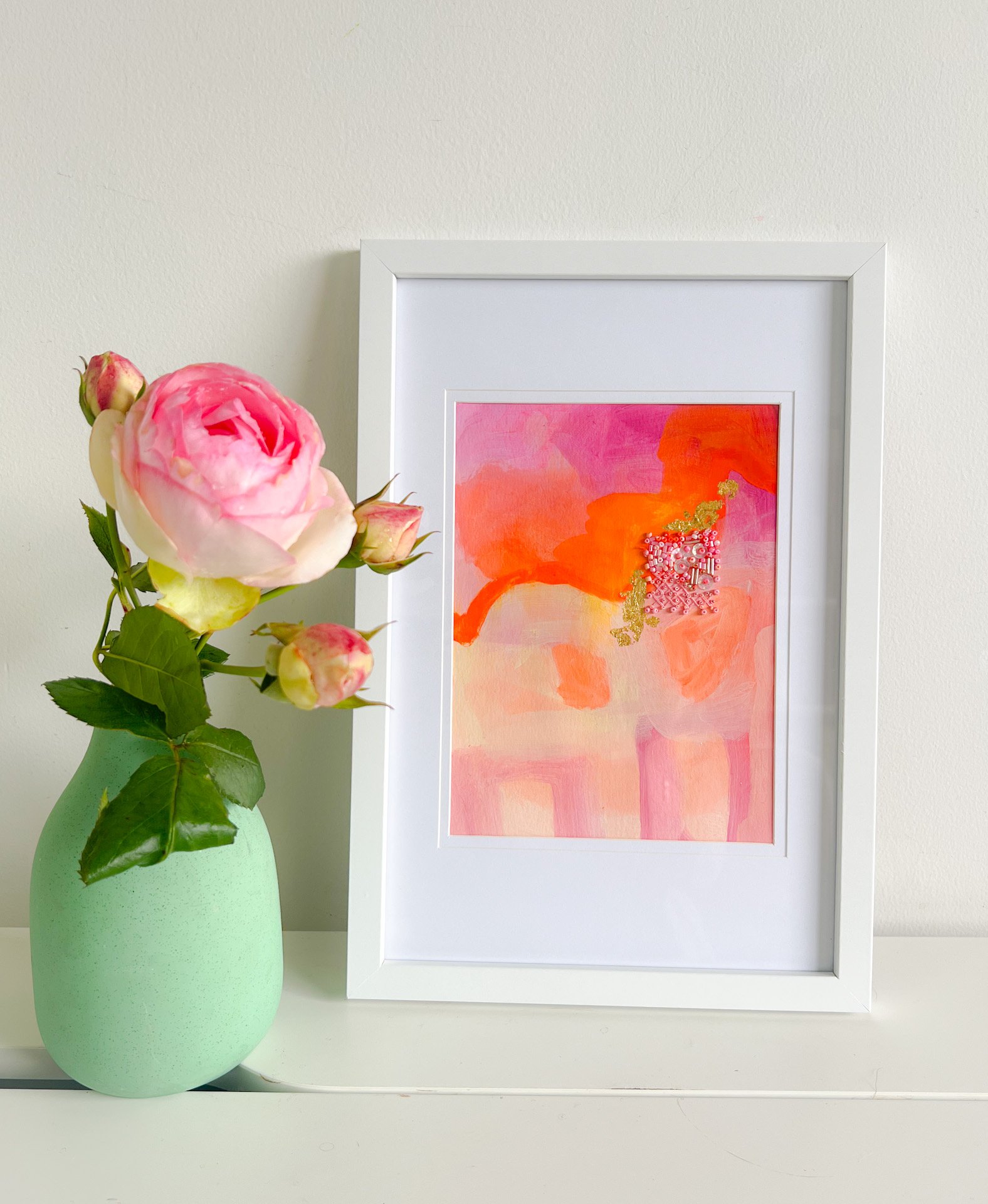
This original mixed media painting came from thinking about the complexities of connection—how we can feel close to someone yet still experience distance. The bold red form and soft pink background create a visual conversation about proximity and separation, while hundreds of hand-placed glass beads add an intimate, tactile detail at the center.
Exploring Emotional Spaces Through Abstract Art
I'm drawn to exploring the emotional spaces between people—what's said and unsaid, the moments of reaching and holding back. This small abstract painting captures feelings of love, longing, and the quiet distance that can exist even in close relationships. But like all abstract work, it invites your own interpretation and experience.
Hand-Beaded Mixed Media Technique
The glass beads in shades of coral, pink, red, and orange are carefully hand-placed to catch the light and create texture. This tactile element adds depth to the painted surface, combining traditional painting techniques with textile and beadwork craftsmanship.
Artwork Details
Medium: Mixed media (acrylic paint and glass beads on canvas)
Dimensions: 13 x 18 cm (small original painting)
Style: Contemporary abstract art
Framing: Unframed, ready to hang
Here and There - An Abstract Beaded Painting
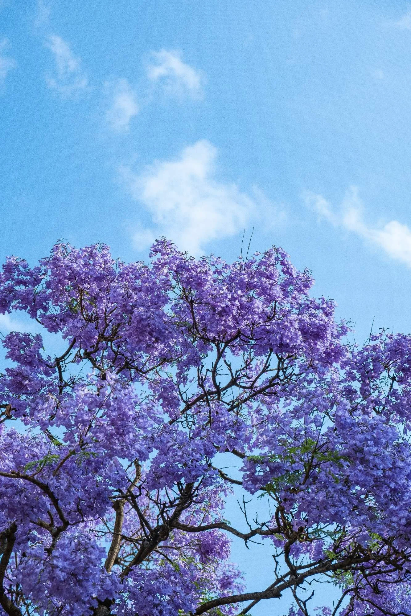
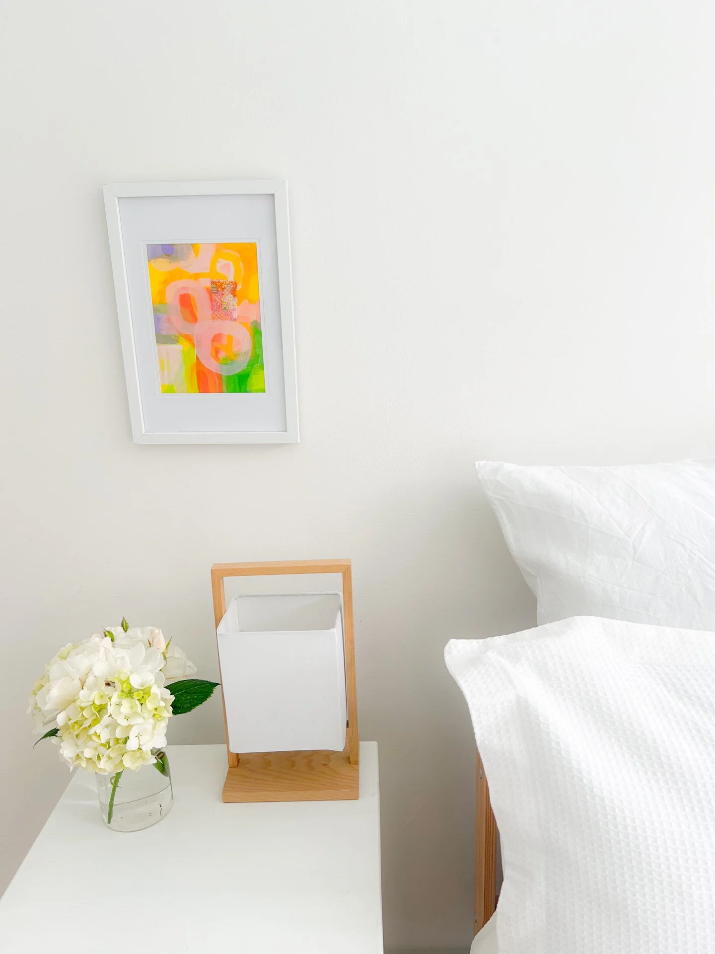
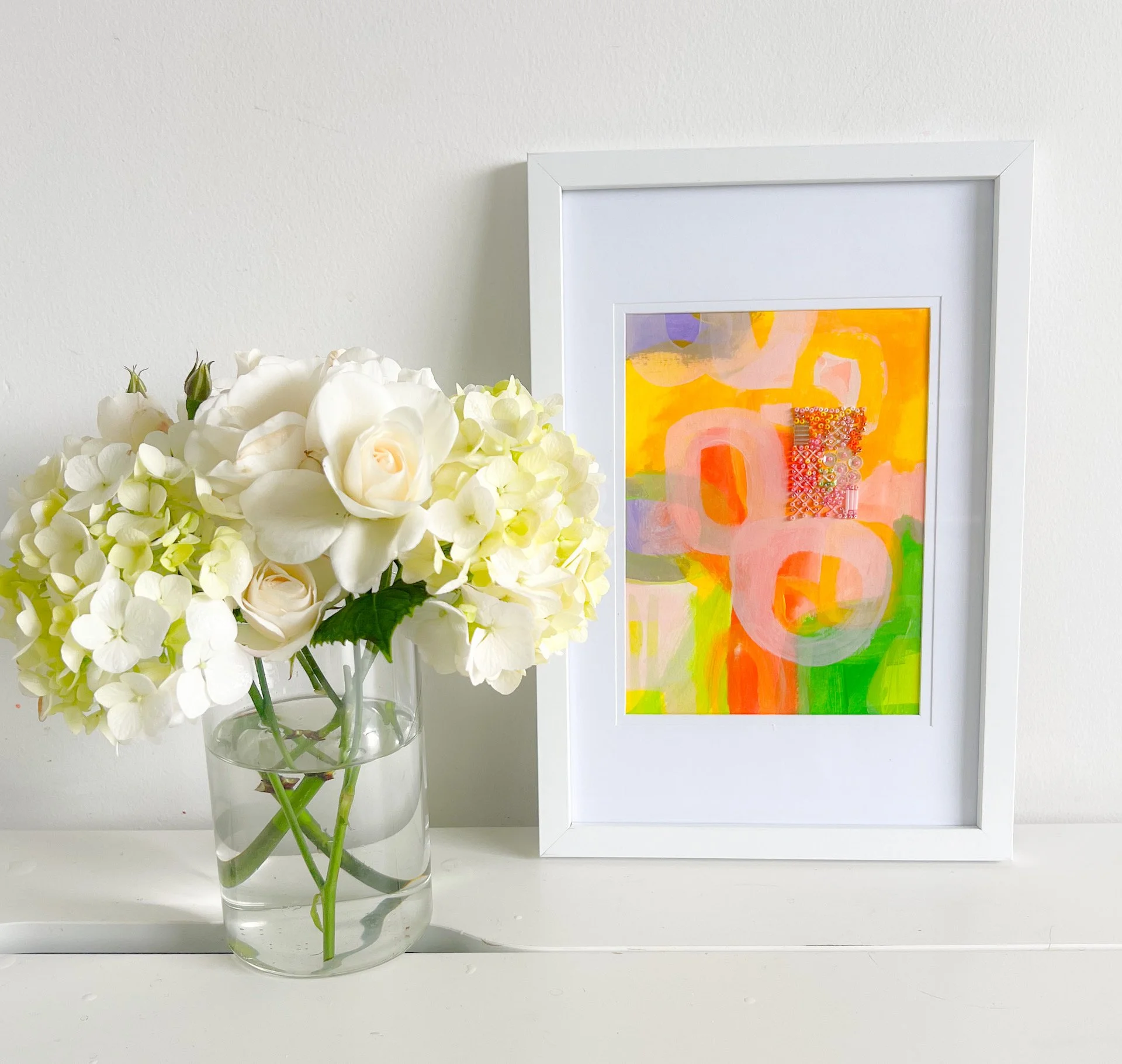
Here and There is a new small beaded painting that continues my exploration of flowers and trees with paint, embroidery and beading in my art practice. I am constantly inspired by the landscape that surrounds me in my garden and neighbourhood. I first noticed the Jacaranda blooming in late spring on my walk down to the beach. The beautiful vibrant purple color springing up in the neighbourhood could not be ignored and I knew it would become a painting.
Why Beadwork
The beadwork represents light dancing across foliage and flowers, that sparkle and brightness that makes everything feel so alive.This 21cm x 17cm piece began as it always does: vibrant color, loose brushwork, those circular forms that keep appearing in my work. But this time, I added hand-beaded embellishment that transforms paint into light.
There's something about beadwork that painting alone can't capture. Each bead catches and reflects light differently as you move around the piece. It's dimensional, tactile, alive in a way that flat paint isn't. The process of adding beads to the canvas is very meditative. Each tiny bead creates a rhythm that slows me down and keeps me present in the moment.
You need you to step into the painting to see the individual beads, the layering of acrylic and oil pastel underneath. Combining traditional painting techniques with beadwork lets me literally add light to the work. Paint can represent shimmer but the beads actually create it. It's a beautiful marriage of craft and art, patience and spontaneity.
I'm continuing this beaded series throughout 2026, so if you're interested in seeing where this exploration takes me, follow along.
Summer Dreams: Abstract Nature Painting in Acrylics and Oil Pastels
Capturing Summer Light and Water in Abstract Art
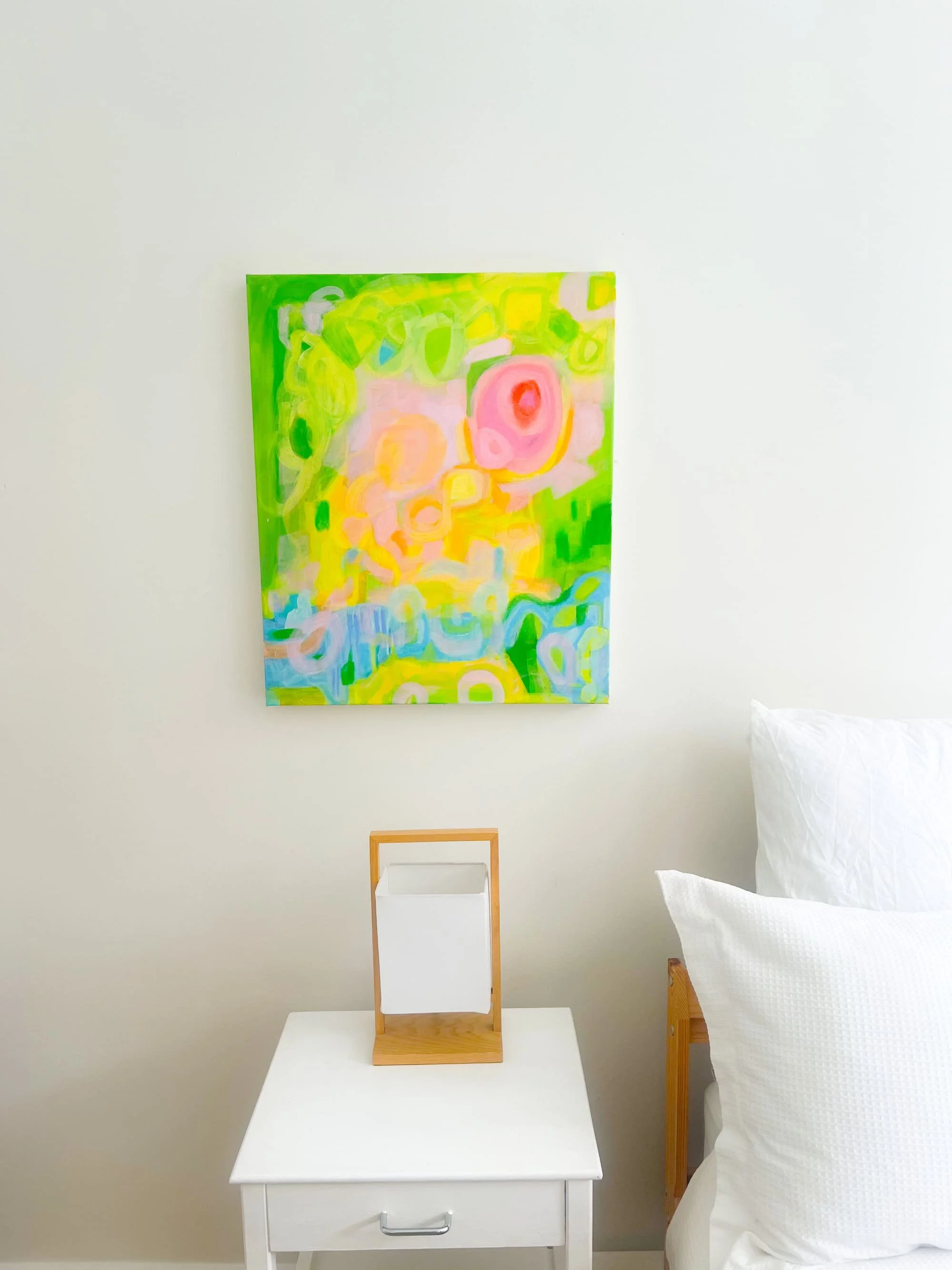
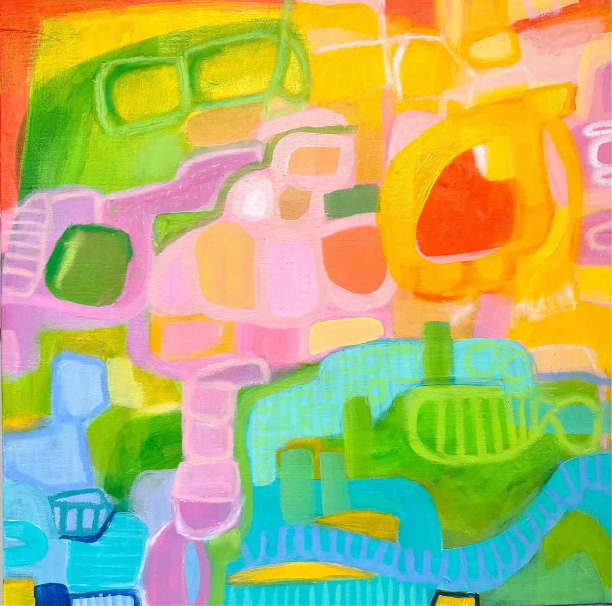
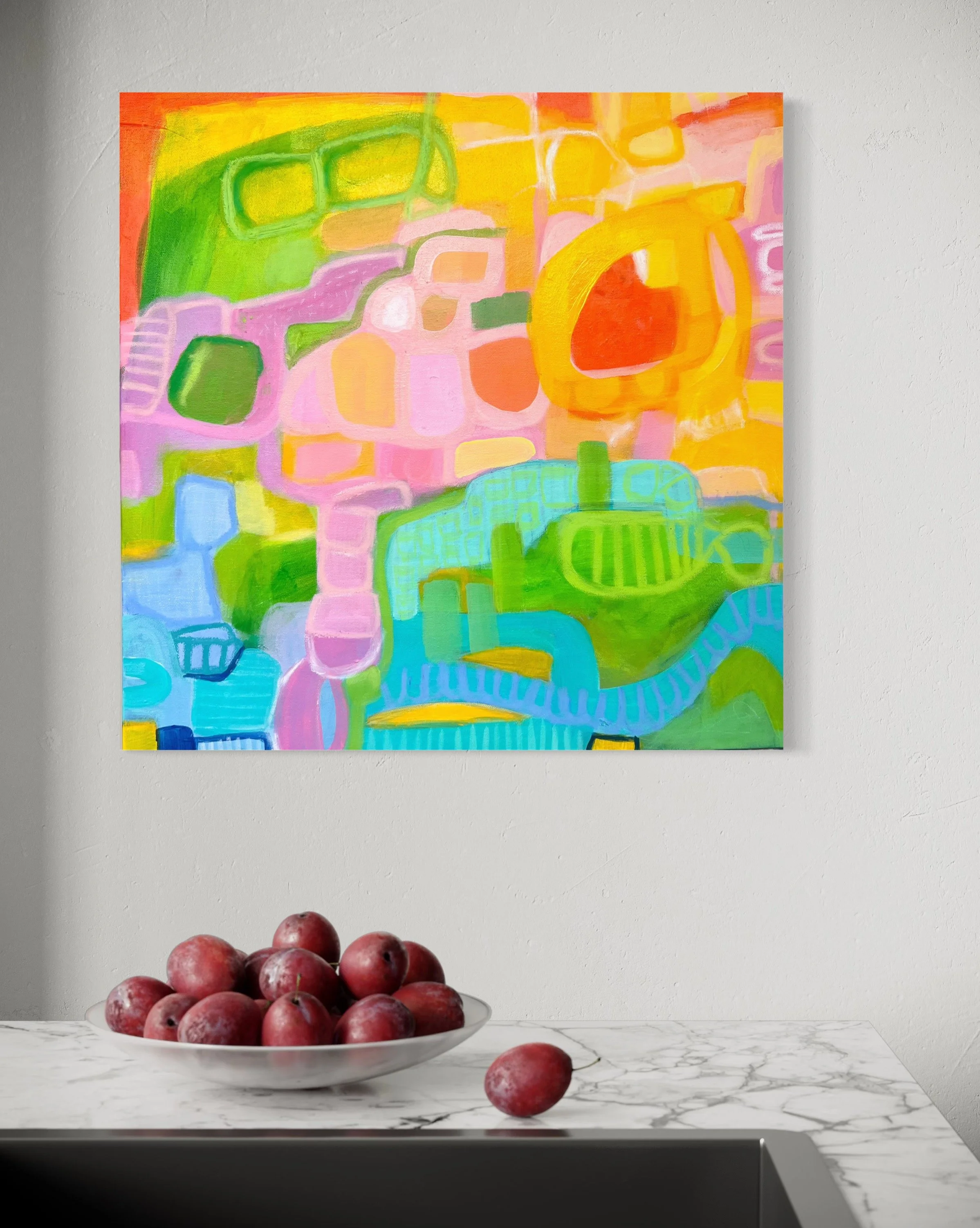
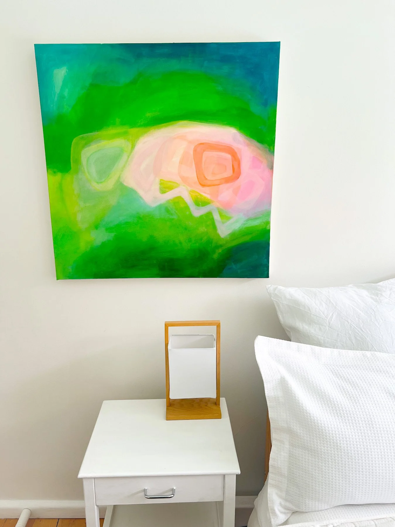
Summer Dreams is my latest nature-inspired painting, created with acrylics and oil pastels to capture that magical midsummer feeling in Melbourne—when light dances on water and the landscape glows with color.
The Inspiration Behind the Painting
Like most of my artwork, this piece draws from my deep connection to nature and the changing landscape. I wanted to express the intensity of midsummer—that moment when sunshine filters through bright green foliage and shimmers across water.
Colors and Composition
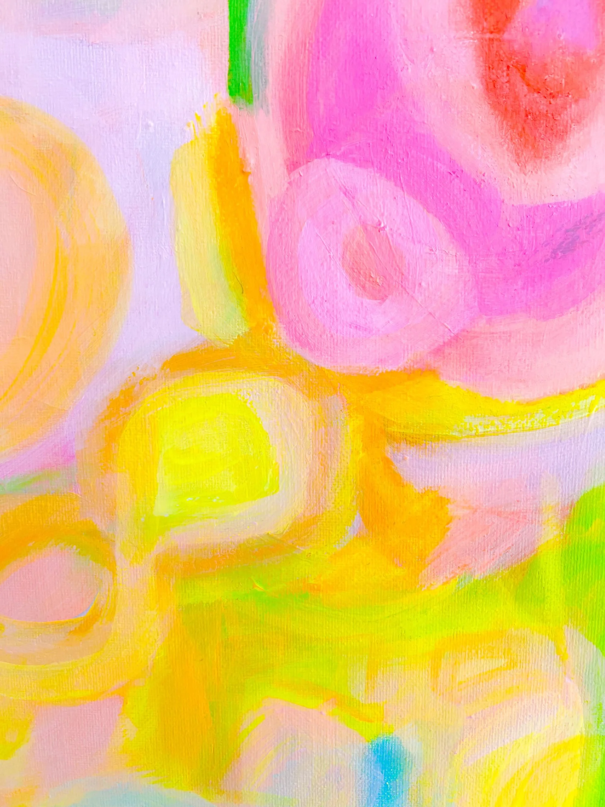
This painting features vibrant greens and yellows representing summer foliage in dappled sunlight. Soft pinks and peachy tones emerge in the center, creating dreamlike abstract forms that suggest flowers and reflections. The blues and aquas reflecting the coolness of water. The painting measures 61 cm x 51 cm.
Abstract Landscape Art
Rather than depicting a specific place, this abstract landscape painting distills the essence of summer into color and form—the warmth of sunshine, the coolness of water, and the abundance of nature at its peak. This artwork is full of energy and bold color—definitely not for minimalists! It's for those who love vibrant, expressive art that makes a statement and brings joy to a space.
Monday, 2026 Color Study
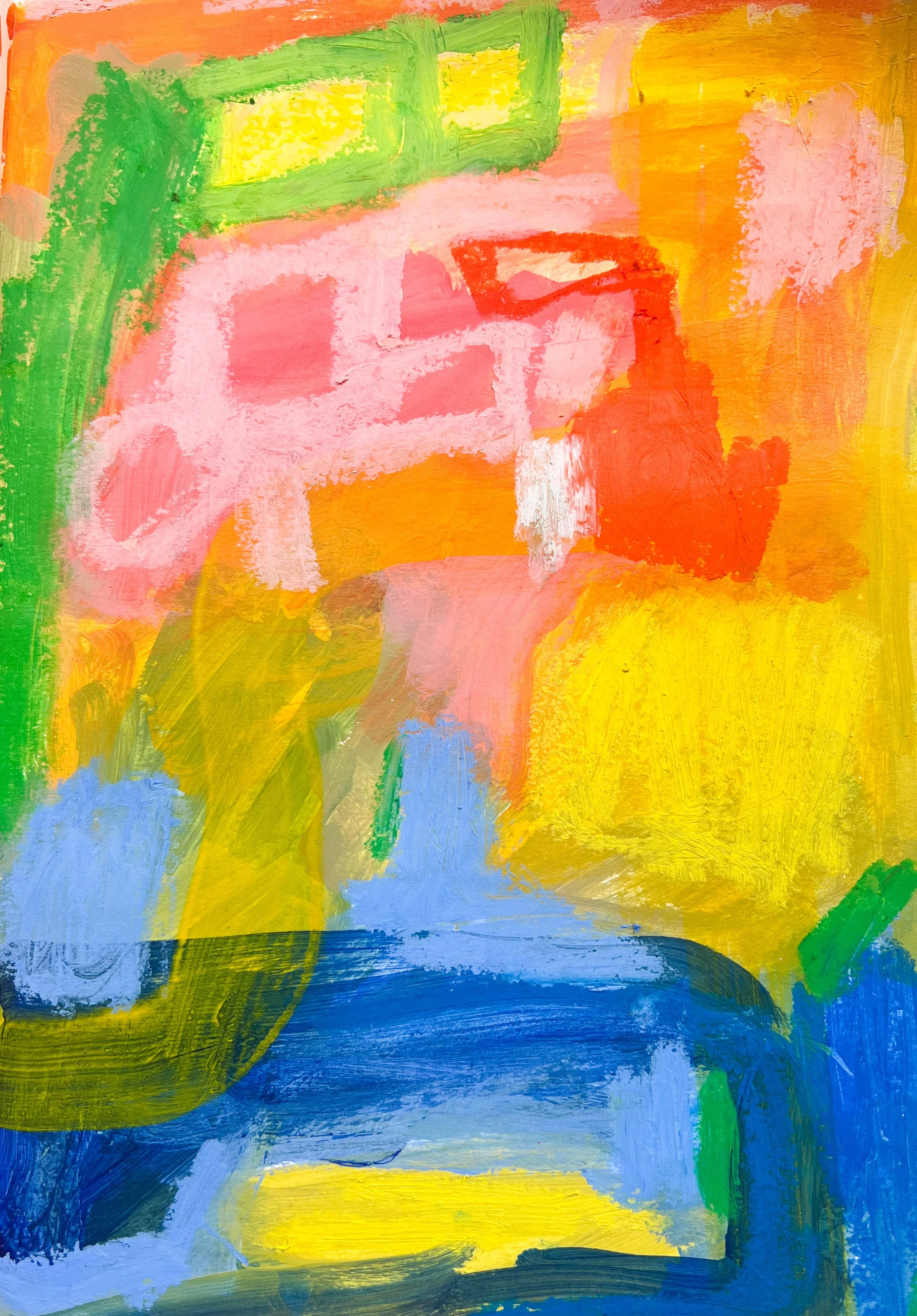
Recently I shared with you that every Monday I would post a color study exploring colors as part of my art practice.
I have added a few studies to the 2026 color studies page already but thought I would share today’s study with its own blog post.
I like very strong bold colors for most of my paintings. They are a contrast to a sometimes bland, beige and sometimes very sad world. The colors give me joy and hope and reflect all the positive things that are also possible.
This quick color study is about Melbourne in summer a theme I am exploring with quite alot of my current art.
Color Study 5
Hot Days, Cool Water: Melbourne Summer Abstract Painting
January in Melbourne. The Christmas celebrations have come to an end and New Year’s Day was yesterday.
It’s a hot summer morning and the sun at 11 am is very high in the sky. A very blue clear sky. There is a light breeze but the light is bright and piercing.
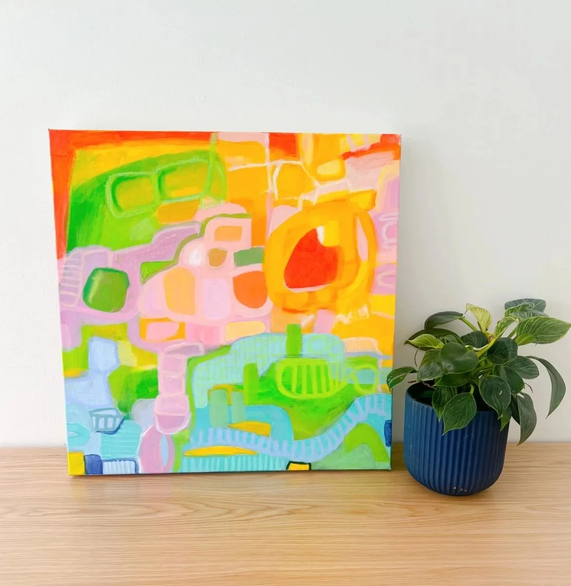
This abstract artwork reflects walking down to Brighton Beach in early January on a hot morning. The brilliant blue sky as you walk the suburban streets, past the houses with the big red and pink blooms of roses and petunias. The streets are shimmering with heat, the promise of the bay appearing on the horizon. The heat. The anticipation. The pathway from hot to cool.
This painting is bold, unapologetic color because that's how summer in Australia feels to me - vibrant, energetic, alive. It’s also the first painting for 2026 reflecting the optimism I have for the year ahead!
This original abstract painting (50 x 50cm, acrylic and oil pastels on canvas).
New Collection: Abstract Embroidery Art Coming January 2026
The Beauty of Hand-Embroidered Abstract Art
What makes embroidery such a compelling medium for abstract work? Each piece carries an intimate quality that only hand-worked textile art can achieve. The texture of thread creates depth and dimension impossible to replicate with paint alone. Every stitch becomes a meditation—a slow, contemplative practice that mirrors the experience of being truly present in nature.
A defining feature of this collection are the bold colors and the linear element that flows through each composition—a continuous line or form that anchors the abstract botanical shapes and creates visual movement across the fabric. Combined with hand-beaded embellishments that catch the light, these embroideries offer an ever-changing visual experience depending on how they're viewed.
Like all my work, these embroideries draw inspiration from the landscape around me. The colors and patterns are of the bay and the nature of the beachside suburbs of Melbourne to the lush abundance of the Victorian countryside. The paintings are about the feeling of sunlight through leaves, the rhythm of flowers, the way colors shift and blend in the sun.
Collection Details
The Abstracat Embroidery collection includes:
Two larger embroidery pieces at 30 x 30 cm
Four smaller works measuring 18 x 15 cm
Each piece is an original, one-of-a-kind artwork, hand-stitched with care and attention to detail.
This embroidery collection will launch in late January 2026 and will be available through this website. If you'd like to be notified when the collection goes live then sign up below.
I can't wait to share these pieces with you and I hope they bring that same sense of calm and connection with nature into your space.
10-Minute Color Studies: Painting Joy After a Long Year
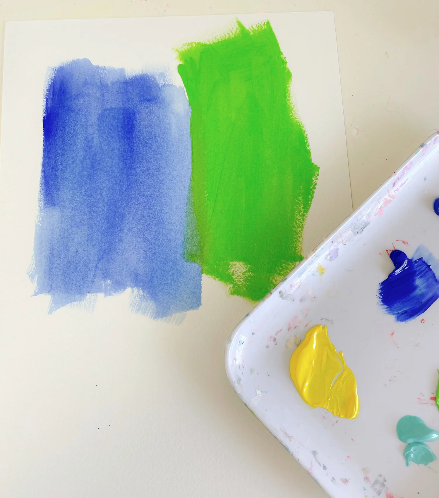
One of the things that brings me the most joy as an artist is painting in my sketchbook. It's free, loose, and completely without rules. I can explore any color combination I like and let the paint do what it wants to do.
These quick painting studies take no more than 10 minutes each. No overthinking. No perfection. Just pure creative play.
Inspiration from My Garden
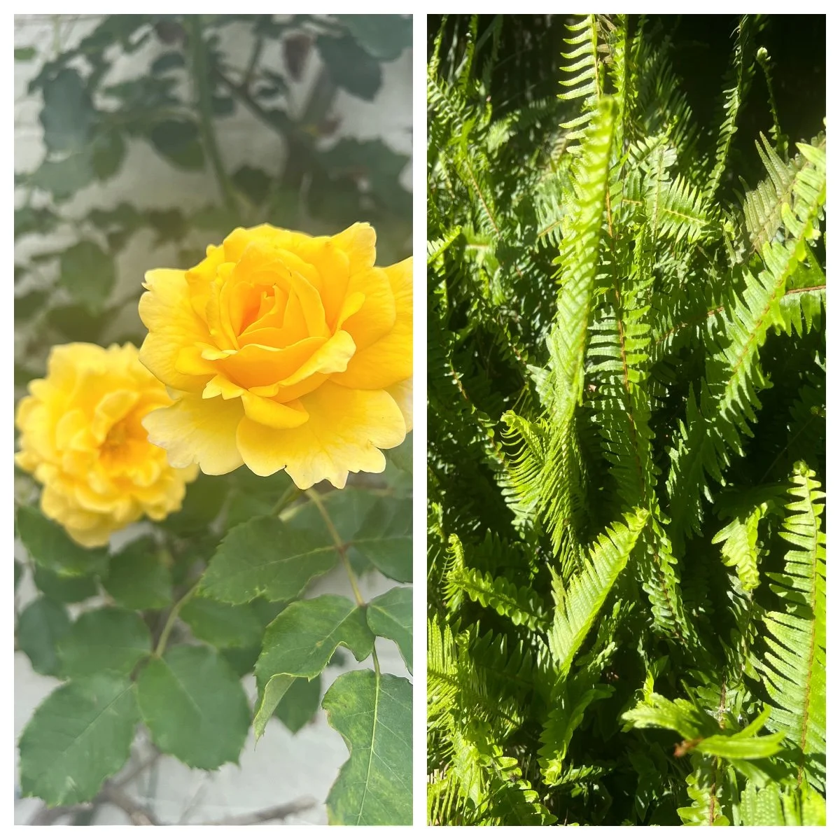
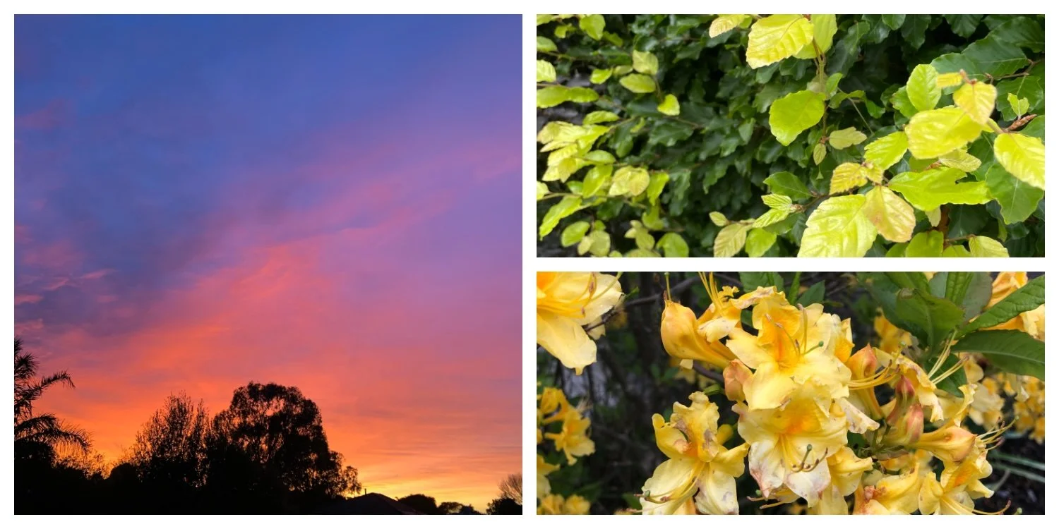
Yellow roses and green ferns in Melbourne garden - inspiration for abstract color study
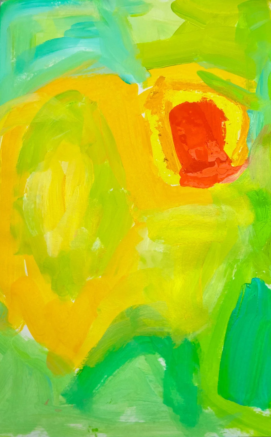
Today's color study came directly from my garden - yellow roses glowing in the sunshine and the bright lime-green light filtering through the ferns in the back garden. The turquoise is the ocean at the end of my street.
I'm not trying to recreate what I see literally - I'm capturing the feeling of those colors, the joy of that light. When I pick up my brush and squeeze paint straight from the tube onto the page, I'm painting my world - the everyday beauty that surrounds me.
Much of my work is inspired by these daily moments: the plants and flowers in my garden, the changing state of the sky, the colors of the ocean just down the road. These aren't grand landscapes or exotic destinations - they're the small, joyful things I notice every day.
That's what feeds my color choices and finds its way into both these quick studies and my larger abstract paintings.
These 10-minute sketches aren't meant to become finished paintings. They're warm-ups, explorations, moments of creative release. They help me stay loose and playful, which feeds into my larger abstract work.
Every Monday in 2026
I'll be sharing these color studies every Monday on the blog and Instagram - a window into my studio practice and creative process. Here's to painting without rules and finding joy in the everyday. Sign up to Art Notes below if you want to follow along as I explore color combinations inspired by my garden, the sea, and the Melbourne sky.
Pink Hydrangea Abstract Painting - Large Floral Art Inspired by Melbourne Summer
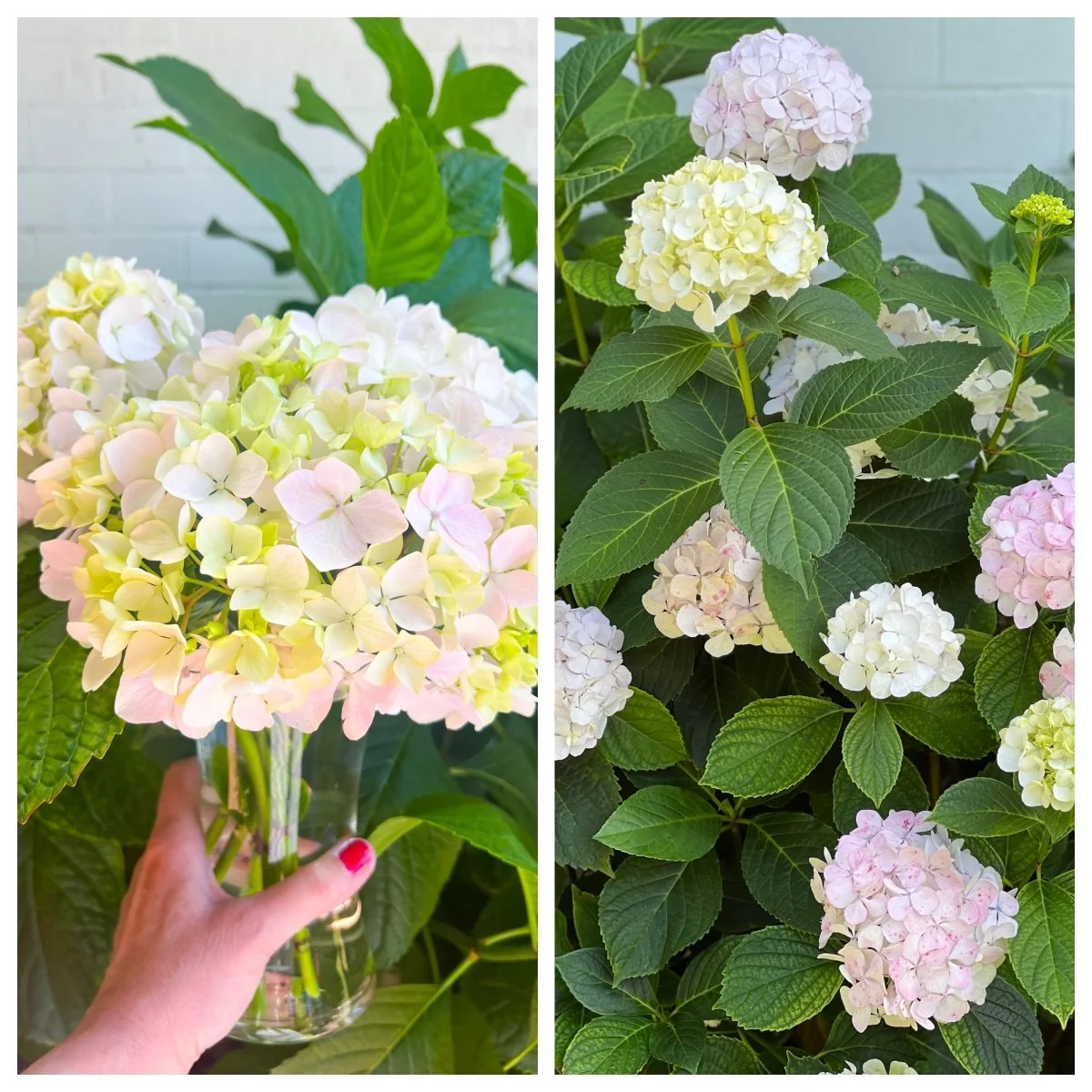
After Melbourne's cold winter and wet spring, summer has finally arrived—and so have the hydrangeas. The Hydrangeas are the inspiration for a large abstract floral painting (120 x 90 cm) which captures the joy of these blooming beauties with their soft, round petals in shades of pink, green, and cream.
Pink and cream hydrangea flowers in bloom - natural inspiration for abstract hydrangea painting
The Color Story
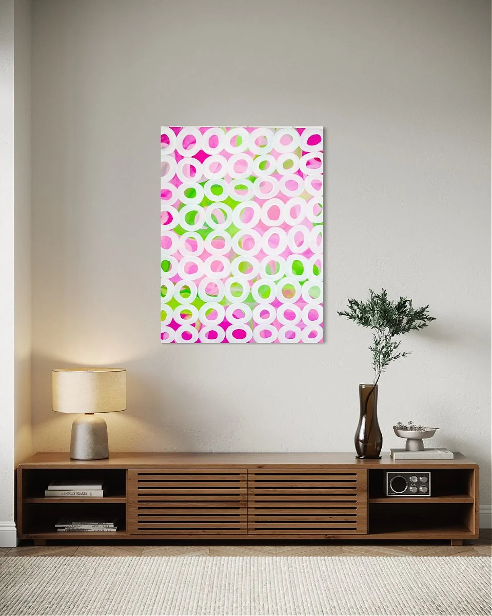
Here's the thing about hydrangeas - they're not just one pink. They're a whole symphony of pinks, from deep fuchsia to the softest blush, with fresh lime greens and creamy whites creating depth and contrast. This pink and green abstract art brings that natural color story to life on canvas. The all-over circle pattern echoes hydrangea's clustered blooms, with vibrant pinks and greens dancing underneath. While the pattern is repetitive, it's never boring. It's what makes this contemporary floral painting both calming and energizing. This painting makes me smile. It's joyful, it's bold, and it doesn't take itself too seriously. Plus, it'll bring a massive pop of color to any space that needs a bit of "hello!" I called it Hydrangeas because, well, obviously. Sometimes the simplest answer is the right one.
Hydrangeas Abstract Painting in pinks, greens and white
Painting Details:
Size: 120 x 90 cm (large statement piece)
Style: Abstract floral art
Colors: Pink, fuchsia, green, cream, white.
This painting is now in a private collection.
Garden Light when Summer meets Summer Garden
This painting titled ‘Garden Light’ is all about that magical hour when a hot summer afternoon tips into evening. The sky's doing its thing with those peachy-coral tones, and meanwhile your garden is still absolutely lush and green because it's been drinking in sunshine all day. It's that gorgeous contrast between the warm sunset glow and the cool, deep greens of foliage that just hits differently.
I've built this one up in layers that let the light move through the painting the way it moves through leaves. Because that's what gets me about being in a garden at sunset on a warm summer evening in Melbourne. Everything's translucent and glowing. The coral-orange flowers catching that last bit of light, the way green looks almost luminous when the sun's low. It's not about painting what you see literally—it's about capturing that feeling of being absolutely wrapped up in color and warmth and life.
The beauty of working in layers like this is you get depth. The layers add real atmospheric quality where you feel like you could step into the painting and smell the warm earth and the flowers. Each glaze adds another dimension, another temperature of color, another memory of a perfect summer evening.
This is a big one too—73 x 73 cm—so it's got presence. It's the kind of piece that brings that outdoor summer magic indoors, especially when we're stuck in the grey months and need reminding that lush, warm, color-drenched evenings are actually real and will come back around.
If you've ever stood in a garden at sunset and thought "I want to bottle this feeling," well, that's what I was after with Garden Light. Pure summer bliss on canvas. Garden Light is available as an original painting on Blue Thumb.
Summer Blooms
A Celebration of Roses, Sea and Sandy Soil
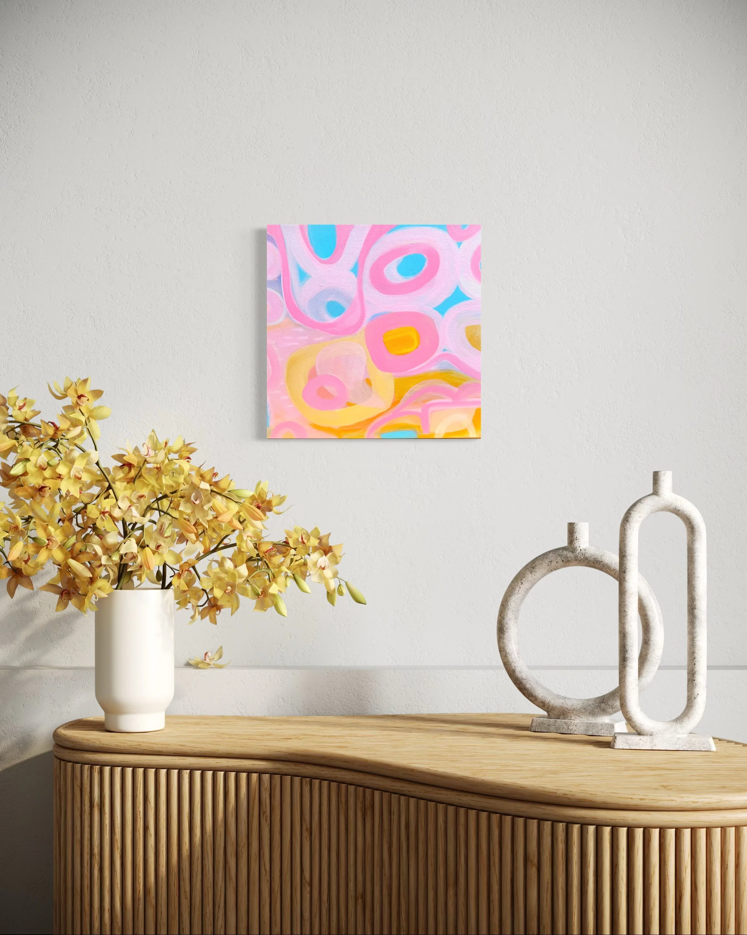
You know that feeling when summer just hits differently? When the light is golden, the air smells like salt and roses, and everything feels a bit more alive? That's exactly what I wanted to capture with "Summer Blooms," and honestly, I'm so thrilled with how this little 35x35cm piece turned out.
The Inspiration: Where Garden meets Sea
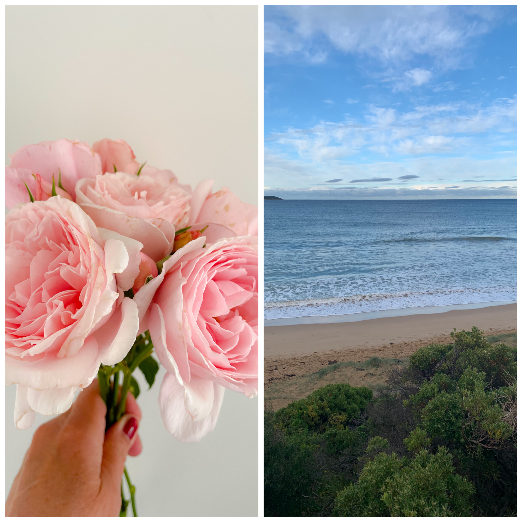
This painting started, as so many of my works do, with me standing in my garden with my cup of tea, completely mesmerized by the pink roses growing against our fence. They're these gorgeous, soft things—not the perfect florist roses, but the ones that are a bit wild and utterly glorious. The pink was so saturated and beautiful, and I kept thinking about how that color sits next to the deep blue of the sea when I walk down to the beach.
I'm absolutely obsessed with the coast. Living near the water means I'm constantly influenced by those incredible blues and turquoises, and I knew I wanted them as the foundation of this piece. But here's the thing—it's not just about pretty colors for me. It's about capturing a feeling, a moment, an essence. The browns you see in the painting? They're my nod to the sandy soil in my garden, that earthy base that everything grows from. It grounds the whole composition and stops it from being too sweet.
The Creative Process: Fresh and Spontaneous
The creative process for "Summer Blooms" was relatively spontaneous compared to some of my other work. I worked in layers, but not as many as I sometimes do—I wanted to keep that fresh, immediate energy. I started with the blue background, letting it be bold and confident. Then I built up those organic, rounded forms in pinks and corals, letting them dance across the canvas. The yellows came last, adding that sunny, joyful punch.
Summer blooms abstract
Why Organic Shapes?
The rounded, organic shapes are very much my signature at the moment. I'm drawn to forms that feel natural and flowing rather than geometric or rigid. There's something about curves and soft edges that feels more human, more connected to the natural world I'm so inspired by.
This piece has quite a playful energy to it. The composition is rhythmic—your eye moves around the canvas, discovering new relationships between the shapes. I wanted it to feel uplifting, the kind of painting that makes you smile when you walk past it. Perfect for bringing that summer feeling into your home all year round.
The Final Thought
I think what I'm most pleased about with "Summer Blooms" is how it captures that intersection of garden and sea that defines where I live and what I love. It's not trying to be anything other than a celebration of color, nature, and joy. And honestly? We could all use a bit more of that in our lives.
If you're drawn to vibrant colors, coastal living, or just want something that brings a bit of sunshine into your space, this one's for you. It's available now on my Bluethumb gallery, and I'd absolutely love to know what you think of it!
Fluid Structures
A New Abstract Art Collection Born from Saturday Morning Tea and Corporate Grey
You know that feeling when you've spent all week in beige, grey meeting rooms with everyone wearing dark blue, black and grey suits, grey...well, everything? That's my Monday to Friday. I work in the corporate world during the week, and while I enjoy what I do, by Friday evening I am in need of color. So most Saturday mornings, like clockwork, I wake up at around 9 am make myself a proper cup of tea, and wander into my studio. And that's when the magic happens.
Fluid Structure is the collection that emerged from those glorious Saturday painting marathons - a collection born from pure joy, liberation, and my absolute need to splash bold, brilliant, unapologetic color across canvas.
The Story Behind the Series
When I started this collection, I had one clear intention: I wanted to create paintings that captured the feeling of the everyday Australian landscape around me, not the literal view. Not another beach scene or gum tree (though I love those!), but the emotion of being outside - the energy, the light, the way the coastal breeze feels on your skin, the brightness that makes you squint and smile at the same time. I wanted to use big, bright bold colors!
I wanted bold. I wanted bright. I wanted paintstrokes that felt alive.
The title "Fluid Structure" might sound like a contradiction, but that's exactly the point. Life itself is this beautiful tension between flowing, organic moments and the structure we need to make sense of it all. Just like my weeks - structured corporate days that flow into fluid, creative weekends.
Color is My Oxygen
Let me be completely honest with you: I'm obsessed with color. Not just "I like color" - I mean I NEED it the way some people need coffee.
My Saturday Morning Color Palette:
Hot pinks that sing
Oranges that glow like sunset
Fresh, zesty greens
Yellows that radiate pure joy
Coastal blues and turquoises
Soft peachy-pinks that whisper
When you spend your working life surrounded by neutrals (corporate beige and grey, I'm looking at you), bright color becomes revolutionary. It's rebellion. It's freedom. It's Saturday morning in paint form.
The Joy of Bold Brushstrokes
What I love about abstract art - and what I discovered while creating Fluid Structure - is that you can feel completely liberated from "getting it right."
There's no "correct" way to paint a feeling.
My brushstrokes in this series are bold, loose, organic. They're circular, flowing, overlapping - like rock pools, like clouds, like the way water moves, like the shapes you see when you close your eyes in bright sunlight.
I'm not trying to paint what the landscape looks like. I'm painting what it feels like.
Adding the Sparkle: Beads, Texture & Gold Leaf
Here's where I get to add my favorite bit - the texture!
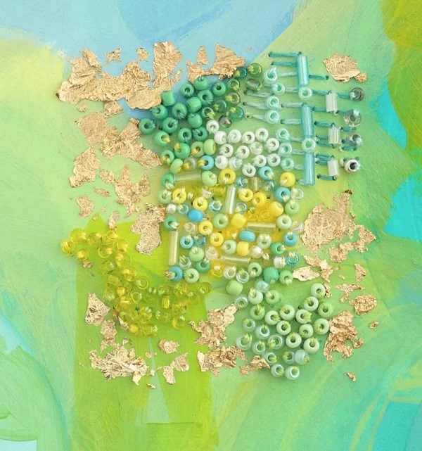
Some pieces in the Fluid Structure collection feature hand-stitched embellishments with beads and gold leaf. Why? Because sometimes a painting needs that extra dimension, that tactile quality that makes you want to reach out and touch it.
The beads catch the light. The gold leaf shimmers. These aren't just paintings to look at - they're paintings that interact with your space, changing as the light moves throughout the day.
It's my way of bringing even more life and energy into each piece.
Coastal Breeze
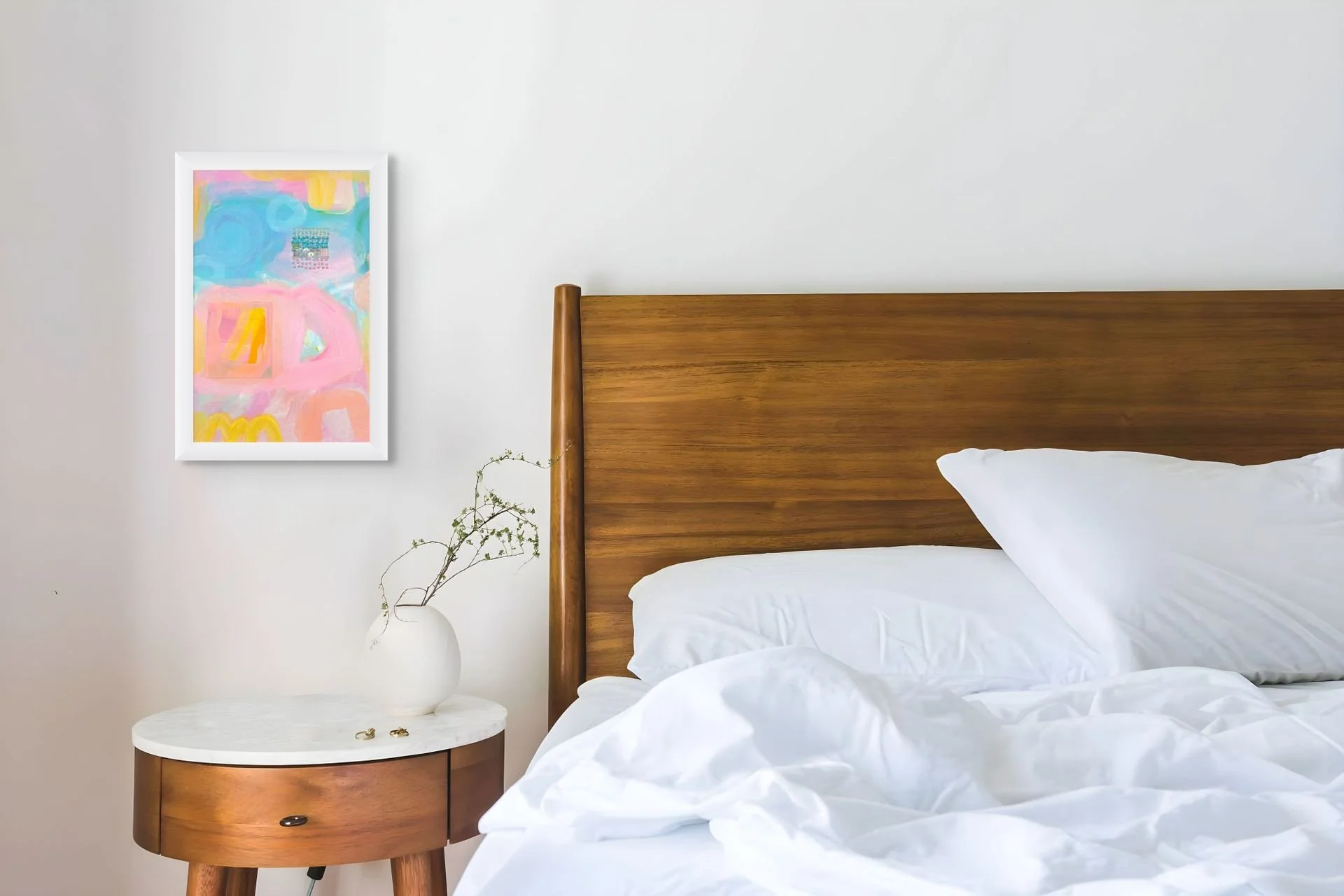
One of my favorite pieces from the series shows this philosophy perfectly - soft blues and creams with organic circular forms that echo both sea foam and clouds. It's the feeling of standing at the beach on a perfect spring morning as the sun rises above the horizon when everything feels fresh and possible.
When I look at this piece, I'm transported. Not to a specific place, but to a specific feeling. That's what I want my paintings to do for you.
Bright, Bold, Unapologetically Joyful
When the corporate world can sometimes feel too serious, too grey, too structured... I'm making a case for JOY. For color that makes you smile when you walk past it in the morning. For art that energizes your space rather than just filling it. For paintings that remind you how it feels to be outside, even when you're inside.
Some of these pieces I have kept and the others are now in private collections. Stay tuned for my next series of abstract embroideries in the months ahead.
Because life's too short for grey walls.
Want to see more of my work and creative journey?
Shop original paintings on Bluethumb - all pieces come with Australia-wide shipping and Bluethumb's 7-day money-back guarantee.
